Appearance
Layers
Layers are the building blocks of your design. Each layer is one visual element (the body, a ring, a pointer, a shadow, etc.). They stack from bottom to top.
Managing layers
- Click a layer to select it and see its properties.
- Eye icon: Show or hide a layer.
- +: Add a new layer (shows all available types).
- Duplicate: Copy the selected layer.
- Delete: Remove the selected layer.
- Up/Down arrows: Reorder layers.
- Drag: You can also drag layers to reorder them.
Common properties (all layers)
When you select a layer, the Layer tab shows its unique properties. Every layer type has its own set of parameters. These appear for every layer type:
- Opacity: 0 to 1. How transparent the layer is.
- Offset X: -0.5 to 0.5. Horizontal position offset.
- Offset Y: -0.5 to 0.5. Depth offset.
- Rotation: -180 to 180. Rotation in degrees.
- Scale: 0.1 to 3. Size multiplier.
Layer types
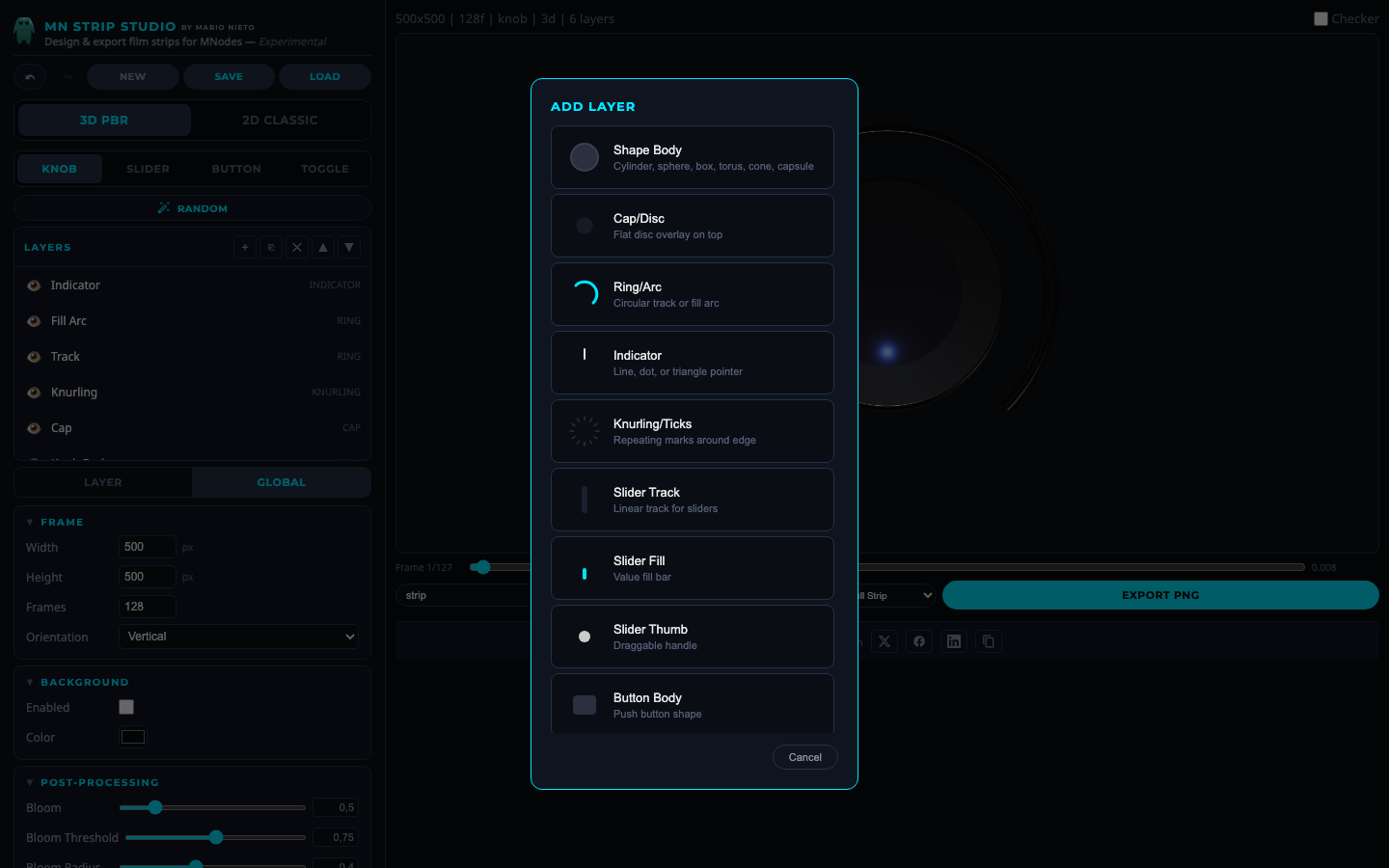 The Add Layer dialog showing all available layer types.
Shape Body
The main 3D body of the control.
| Property | Range | Description |
|---|---|---|
| Shape | lathe, cylinder, sphere, box, torus, cone, capsule | The 3D shape of the body. Lathe is the classic rounded knob shape (3D only) |
| Radius | 0.1 to 0.5 | Size of the body |
| Height | 0.02 to 0.3 | Vertical thickness (3D only) |
| Color | Color picker | Surface color |
| Bevel | On/Off | Rounded edges (3D only) |
Cap / Disc
A flat element on top of the body.
| Property | Range | Description |
|---|---|---|
| Enabled | On/Off | Show or hide the cap |
| Shape | disc, dome, sphere, cone, box | Shape of the cap (3D only) |
| Radius | 0.2 to 0.95 | Size relative to the body |
| Height | 0.002 to 0.15 | Thickness (3D only) |
| Color | Color picker | Surface color |
Ring / Arc
A circular ring or filled arc around the control. Used as a value indicator on knobs. The arc fills based on the current value, showing how far the knob has been turned.
| Property | Range | Description |
|---|---|---|
| Filled | On/Off | Whether the arc fills with the value or is always complete |
| Profile | round, flat, square, diamond | Cross-section shape (3D only) |
| Radius | 0.2 to 0.6 | Distance from center |
| Tube R | 0.005 to 0.08 | Thickness of the ring tube |
| Width | 0.005 to 0.12 | Width when using flat profile (3D only) |
| Start angle | 0 to 360 | Where the arc begins (in degrees) |
| Sweep angle | 10 to 360 | How much of the circle the arc covers |
| Offset Y | -0.1 to 0.1 | Height offset (3D only) |
| Segments | 0 to 60 | Split the arc into dashes. 0 = solid arc |
| Gap | 0.1 to 0.9 | Gap between dashed segments (only when Segments > 0) |
| Taper | 0 to 0.9 | Taper the fill arc width (only when Filled is on) |
| Color | Color picker | Ring color |
| Glow | 0 to 2 | Brightness glow around the ring |
| Emissive | On/Off | Whether the ring emits light |
Indicator
A pointer that shows the current knob position.
| Property | Range | Description |
|---|---|---|
| Type | line, dot, triangle, none | Style of the pointer |
| Size | 0.2 to 3 | Length or size of the indicator |
| Color | Color picker | Indicator color |
| Distance | 0.2 to 0.9 | How far from the center |
Knurling / Ticks
Repeating grip marks around the edge of a knob.
| Property | Range | Description |
|---|---|---|
| Enabled | On/Off | Show or hide knurling |
| Shape | box, sphere, cylinder | Shape of each tick mark |
| Count | 8 to 120 | Number of marks around the circle |
| Width/Size | 0.002 to 0.03 | Width of each mark (or radius for sphere) |
| Height | 0.1 to 1.2 | Height of each mark (not for sphere shape) |
| Depth | 0.002 to 0.04 | Depth of each mark (box shape only) |
| Tilt | 0 to 180 | Angle of each tick |
| Offset Z | -0.15 to 0.15 | Vertical position offset |
| Rotate w/ Knob | On/Off | Whether ticks rotate when the knob turns |
| Color | Color picker | Tick color |
| Active Enabled | On/Off | Light up ticks within the current value range |
| Active Color | Color picker | Color of active ticks (only when Active Enabled is on) |
Slider Track
The groove or rail that a slider thumb moves along.
| Property | Range | Description |
|---|---|---|
| Direction | vertical, horizontal | Orientation of the slider |
| Profile | flat, groove, round | Track cross-section (3D only) |
| Length | 0.3 to 0.95 | How long the track is |
| Width | 0.03 to 0.3 | How wide the track is |
| Depth | 0.01 to 0.12 | How deep the track is (3D only) |
| Color | Color picker | Track color |
Slider Fill
The value bar inside the slider track. Grows from the bottom or left as the value increases.
| Property | Range | Description |
|---|---|---|
| Color | Color picker | Fill color |
| Glow | 0 to 2 | Brightness glow |
| Emissive | On/Off | Whether it emits light |
Slider Thumb
The handle that moves along the slider track.
| Property | Range | Description |
|---|---|---|
| Shape | sphere, cylinder, box | Shape of the thumb (3D only) |
| Size | 0.03 to 0.3 | Thumb size |
| Height | 0.01 to 0.15 | Thumb height/depth (3D only) |
| Color | Color picker | Thumb color |
Button Body
The main shape of a push button.
| Property | Range | Description |
|---|---|---|
| Profile | flat, dome, pillow, inset | Surface shape (3D only) |
| Width | 0.2 to 1 | Button width |
| Height | 0.2 to 1 | Button height |
| Depth | 0.02 to 0.3 | How tall/deep the button is (3D only) |
| Corner | 0 to 0.5 | Corner rounding |
| Bevel | 0 to 0.1 | Edge bevel (3D only) |
| Off Color | Color picker | Color when button is not pressed |
| On Color | Color picker | Color when button is pressed |
| Glow | 0 to 2 | Glow intensity when pressed |
Button Frame
A decorative border ring around the button.
| Property | Range | Description |
|---|---|---|
| Enabled | On/Off | Show or hide the frame |
| Color | Color picker | Frame color |
| Padding | 0.01 to 0.2 | Distance between frame and button body |
Toggle Track
The pill-shaped background of a toggle switch.
| Property | Range | Description |
|---|---|---|
| Track H | 0.08 to 0.5 | Height of the track |
| Ratio | 1.3 to 3.5 | Width to height ratio |
| Depth | 0.02 to 0.15 | Thickness (3D only) |
| Off Color | Color picker | Color when toggle is off |
| On Color | Color picker | Color when toggle is on |
| Glow | 0 to 2 | Glow intensity when on |
Toggle Thumb
The sliding circle inside the toggle.
| Property | Range | Description |
|---|---|---|
| Scale | 0.5 to 1.5 | Size of the thumb relative to the track |
| Padding | 0 to 0.1 | Gap between thumb and track edges |
| Color | Color picker | Thumb color |
Text Label
A text overlay on the design.
| Property | Range | Description |
|---|---|---|
| Text | Free text | The text content to display |
| Font Size | 6 to 72 | Size of the text |
| Color | Color picker | Text color |
Image
Import a custom PNG or SVG image as a layer.
| Property | Range | Description |
|---|---|---|
| Image | File upload | Upload a PNG or SVG file |
| Width | 0.1 to 1 | Display width |
| Height | 0.1 to 1 | Display height |
Drop Shadow
A shadow beneath the control for depth.
| Property | Range | Description |
|---|---|---|
| Color | Color picker | Shadow color |
| Blur | 0 to 30 | Softness of the shadow |
| Offset X | -20 to 20 | Horizontal position |
| Offset Y | -20 to 20 | Vertical position |
| Opacity | 0 to 1 | Shadow transparency |
Highlight
A specular light reflection on the surface.
| Property | Range | Description |
|---|---|---|
| Offset X | -0.5 to 0.5 | Horizontal position |
| Offset Y | -0.5 to 0.5 | Vertical position |
| Size | 0.02 to 0.5 | Size of the highlight |
| Intensity | 0 to 1 | Brightness |
| Blur | 0 to 1 | Softness |
| Color | Color picker | Highlight color |