Appearance
Control Types
Pick the type of control you want to design from the tabs at the top of the left panel. Each type has its own dedicated layers and behaviour.
Knob
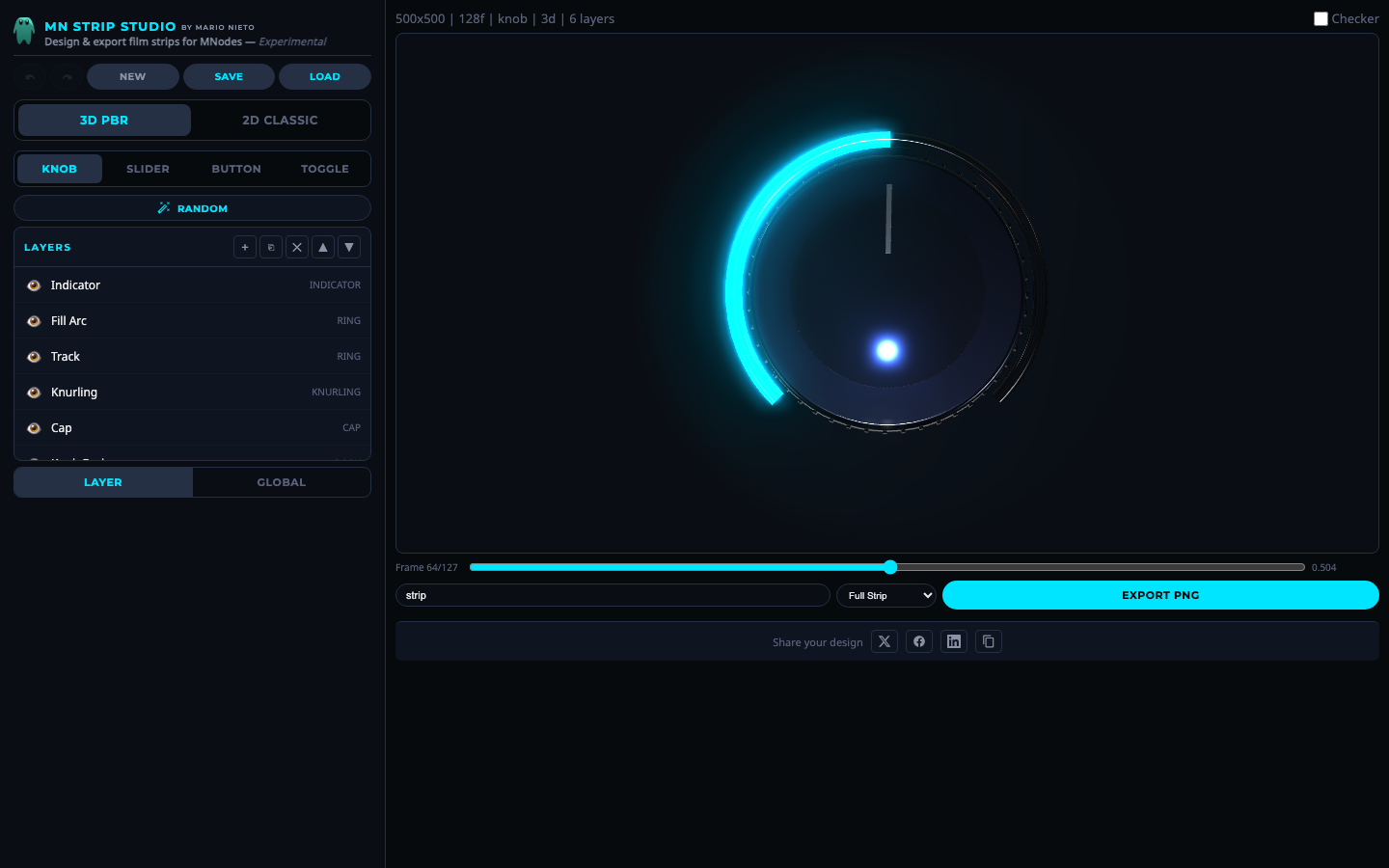 Knob mode with 3D PBR rendering.
A rotary dial. The default rotation arc is 270 degrees (from about 7 o'clock to 5 o'clock, like most hardware knobs). Layers like rings, indicators and knurling animate with the rotation.
Slider
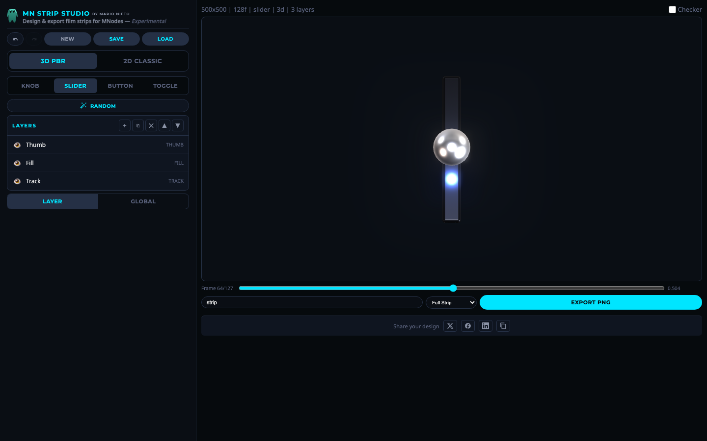 Slider mode.
A linear control. A thumb slides along a track, and a fill bar grows to show the current value. Supports vertical and horizontal directions.
Button
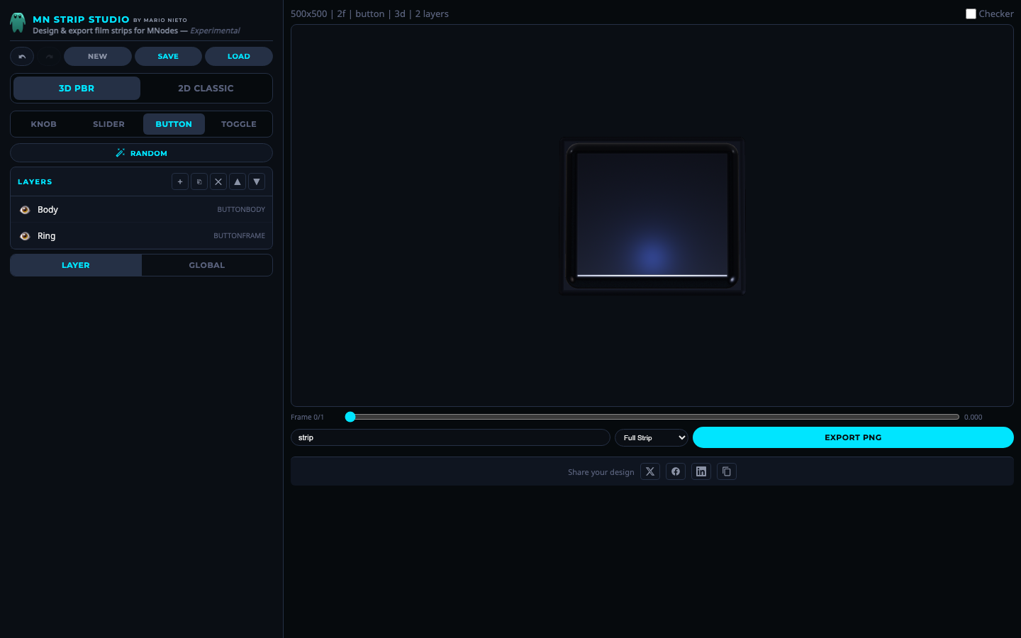 Button mode.
A push button. The animation goes from "not pressed" (value 0) to "pressed" (value 1). Layers change color, depth and glow between off and on states.
Toggle
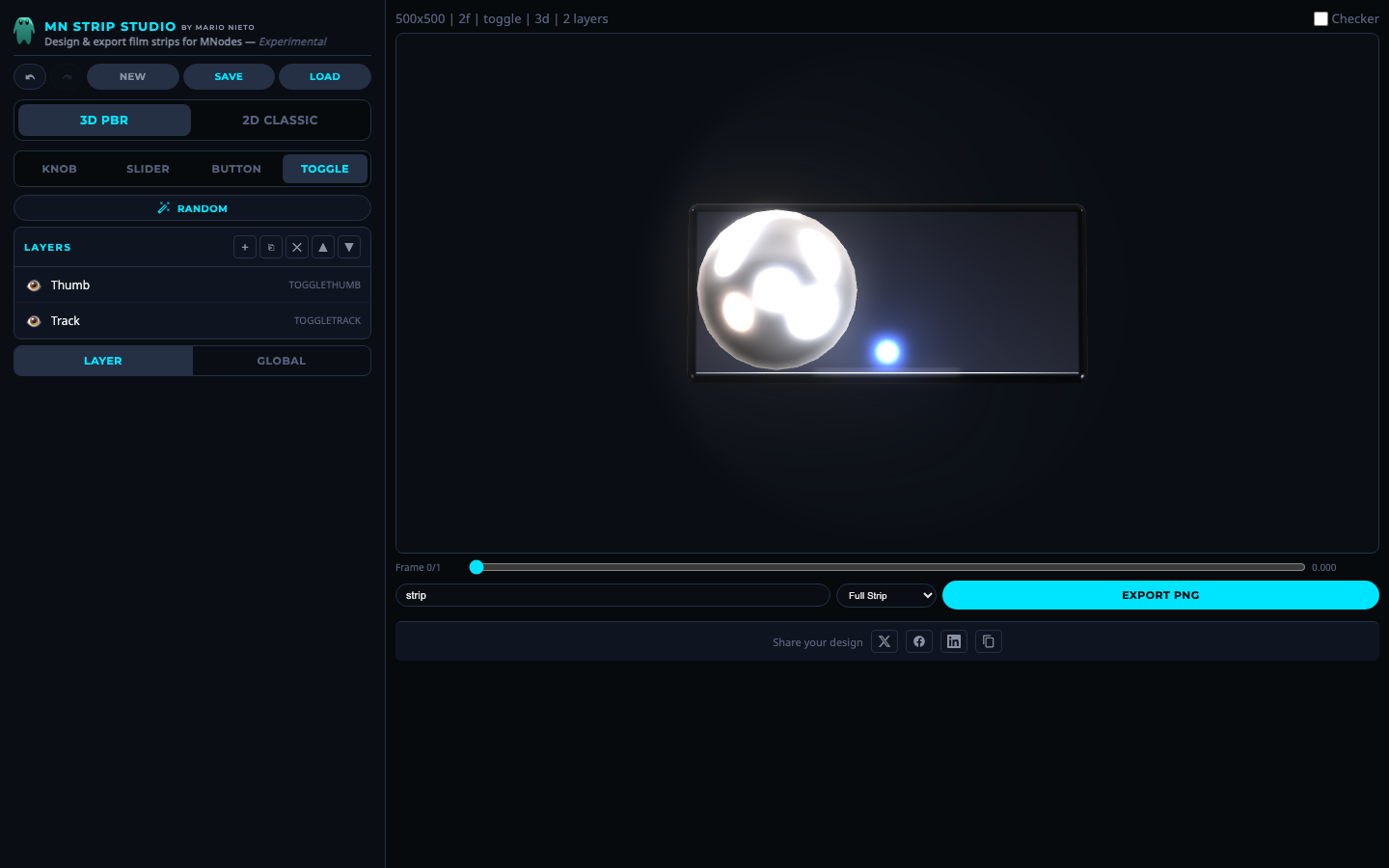 Toggle mode.
An on/off switch. A thumb slides between two positions along a pill-shaped track, changing color to show the state.